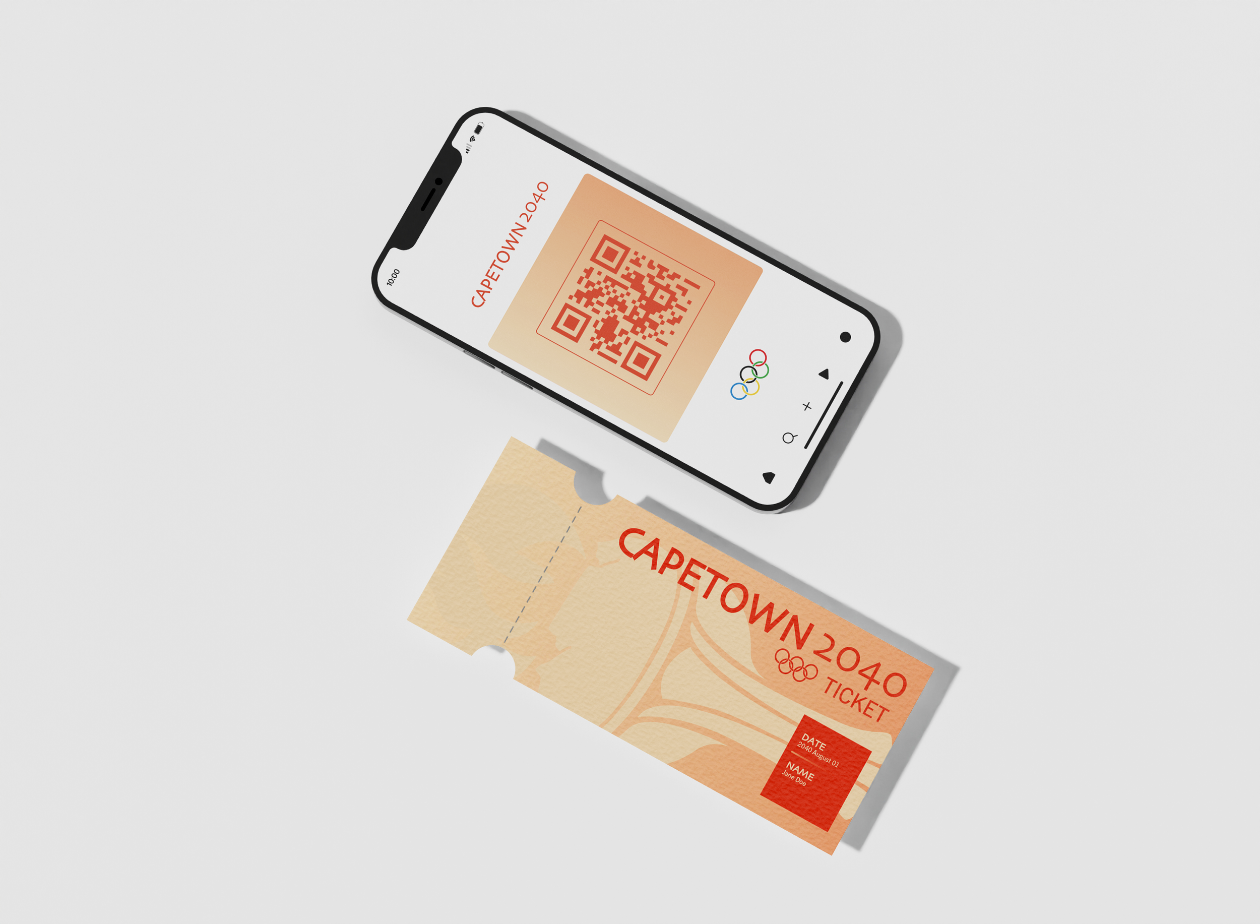


CAPE TOWN 2040 OLYMPICS
*This is an Imaginative Project
The 2040 Olympics Branding Project was designed around the summer games hosted by Cape Town, South Africa—Blending tradition with innovation to create a timeless, dynamic identity rooted in the host city’s culture. More than a logo, it captures the spirit of the Games, global inspiration, and the energy of its time through research, design, and storytelling.

PRIMARY LOGO
The Olympics are more than just a global sporting event—they are a symbol of unity, excellence, and history, with branding that stands the test of time. From the iconic Olympic rings to the bold, dynamic visuals of each host city, Olympic branding must be instantly recognizable, deeply meaningful, and adaptable across cultures and generations.
For the 2040 Olympics, I imagined this visual identity to take place in Cape Town, South Africa and honor that captures the spirit of the games, the essence of the city, and the excitement of the future.

SECONDARY LOGO

ALTERNATE LOGO MARK

SOCCER ICON

BASKETBALL ICON

TENNIS ICON

GYMNASTICS ICON

TRACK & FIELD ICON

SWIMMING ICON

VOLLEYBALL ICON

WATER POLO ICON
CUSTOM COLOR PALETTE AND TYPOGRAPHY